First impressions matter, especially in the job search. Everything on your resume — including your font — plays an essential role in what kind of impression you make on the hiring manager. Unsure what the best font for your resume is? Here’s what you need to know.
What Makes a Font a ‘Best Font for a Resume?’
The best font for a resume is one that is professional, readable, clear, and representative of your personal brand.
You want the hiring manager to read your achievements, experience, and contact information without squinting or guessing what words are on the page.
You also want your font to represent your brand. For example, people looking for a creative career might use fonts that are slightly more decorative, while someone applying for analytical jobs might use a more straightforward font.

Building Your Personal Brand
Learn why your personal brand matters in the job search, assess your current brand, then learn how to use social media to promote it.
Avg. Time: 2-3 hours
Skills you’ll build: Personal brand, image, online presence management, self-assessment, brand management, LinkedIn
12 Best Fonts for a Resume
Now that you know what makes a good resume font, which one should you use? There are typically two types of fonts you can use on a resume: serif fonts and sans serif fonts.
Best Serif Fonts for a Resume
A serif is often called the “feet” of a font. It’s a small feature at the end of letters that makes them appear more decorative and ornamental. Major brands like The New York Times, JPMorgan, and McKinsey & Company use serif fonts for their logos.
Serif fonts are often considered more stylized and elegant. These are particularly effective if you’re applying for more of a creative role.
While many serif fonts are readable on computers, experts recommended using these fonts if you’re printing application materials.
“Their tiny details on the letters make it easier for the eye to recognize quickly on paper,” Chris Lewandowski, recruiter and president of Princess Dental Staffing, says.
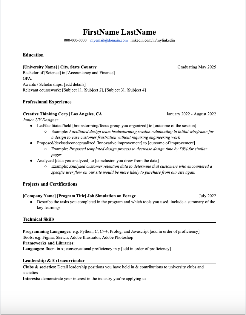
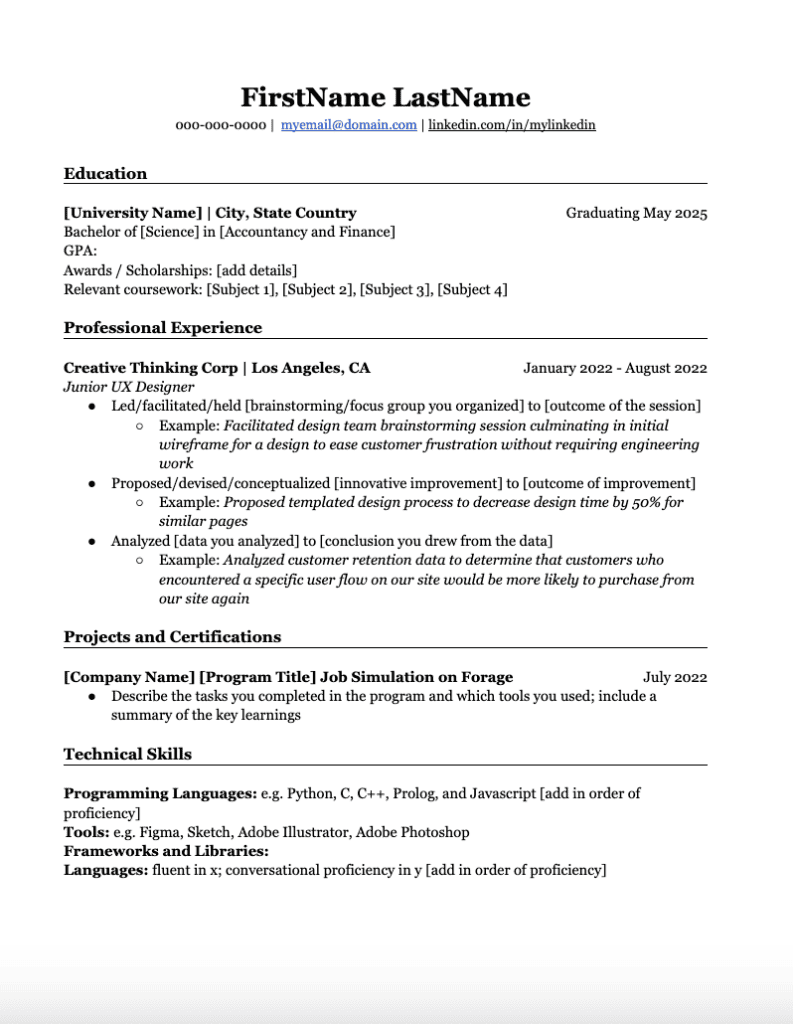
Times New Roman
Times New Roman is a traditional font that you might see as a default for various computer programs. This is a font you’ve likely encountered while in school — some teachers might even prefer it when you’re submitting essays.
Because this font is so commonplace and traditional, it’s good for applying to jobs in more traditional fields like law, finance, and academia. In creative or tech fields, some might consider Times New Roman a bit outdated.
Georgia
If you’re looking for something a little more original compared to Times New Roman, Georgia is a great serif font to use. It offers a similar level of professionalism while offering a modern look.
Georgia was designed specifically for readability on low-resolution computer screens, which makes it a good choice when submitting a resume digitally. The bold version of Georgia is particularly bold, which is also helpful when trying to emphasize specific parts of your resume and make information stand out.
Garamond
Like Times New Roman, Garamond is a timeless serif font, one that follows the model for a typeface cut leading back to the late 1400s. This font is traditional and sophisticated, making it a good choice for conservative fields.
This font tends to be smaller than its other serif counterparts. This means you’ll be able to fit more information onto the page at the same font size; however, be sure the information is easily readable without any eye strain.
Cambria
Cambria is a modern font designed to be readable on both computers and in print. The even spacing and proportions make it a clear, straightforward font that’s a versatile option for a variety of fields. This font offers a good balance between a classic serif style (like Times New Roman) and a more modern feel.
Keep in mind that Cambria is a very neutral font and its bold version is not as visually distinct as other fonts.
Palatino
Palatino offers a professional and elegant look that’s slightly more decorative than Times New Roman. It’s a great choice for resumes in creative fields like design, marketing, or media.
This font is less common than the other best serif resume fonts, so it might not be available on all computer systems — I had to click “add more fonts” to Google docs in order to use it, but it was still available for free. It’s also a bigger font; for example, a size 11 Palatino fits less information on the page than size 11 Times New Roman.
Best Sans Serif Fonts
Sans serif fonts are considered clean, modern, and simple. They don’t have any “feet” or decorative elements to them. Brands like Bank of America, Chipotle, and Meta use serif fonts for their logos.
Sans serif fonts are the best if you’re submitting a resume digitally, whether via email or directly to a company’s application site.
“Since most people are job hunting and processing their applications online, I highly suggest using sans-serif on digital resumes,” Lewandowski says. “This is because fonts such as Arial, Calibri, Tahoma, and Verdana, or those that don’t have intricate details on the letters, are much easier to read on computer screens.”
Arial
Arial is probably the Times New Roman equivalent of sans serif fonts. It’s one of the most popular sans serif fonts and comes pre-installed on most operating systems.
Arial is clean, simple, and easy to read at a variety of sizes — especially on different computer screens.
Calibri
Calibri is a second generation font celebrity; it replaced Times New Roman in Word in the late 2000s and replaced Arial in PowerPoint, Excel, Outlook, and Wordpad. This sleek font with subtly rounded edges remains clear at smaller font sizes.
Like Arial, it’s a neutral font without much character, which works well for more traditional fields.
Open Sans
You might recognize Open Sans from some of Google’s web pages. It’s a neutral and open-source font, meaning it’s free commercially.
Open Sans has a wide variety of weights, meaning it’s a good choice if you’re looking to vary emphasis on your resume while maintaining font consistency. Keep in mind that this is a larger font that takes up more space in smaller sizes.
Verdana
Verdana is a simple, clean font that’s particularly readable at small sizes and on low-resolution computer screens. It has tall lowercase characters and wider proportions.
Verdana is a safe font choice for both printed and digital resumes and a good font choice for traditional fields. Its straightforward design can lack personality, but it offers a professional aesthetic.
Tahoma
Similar to Verdana, Tahoma offers slightly narrower characters and tighter letter spacing. Its bold version stands out significantly because it’s closer to double the pixel width of the non-bold option. Tahoma is a good option if you’re trying to emphasize specific elements of your resume.
Helvetica
Helvetica is a widely popular sans serif font. Originally developed in 1957, the font now has a wide range of variants in its font family — this gives you more flexibility if you’d like to use a combination of variations on your resume.
Helvetica is known for its high character heights and small space in between letters.
Roboto
Roboto is an open-source font that offers both a professional and contemporary aesthetic. It features some curves that make it more distinct from other serif fonts; it also spaces letters based on their natural sizing, which makes it a bit more natural to read. This is a great font choice for resumes in technology or design fields.
Will an Applicant Tracking System (ATS) Rule Out my Resume Based on Font?
An applicant tracking system, often referred to as an ATS, is a way for recruiters to track and easily parse resumes. There are a lot of myths about what an ATS can and can’t do, including that they can rule out resumes if they’re not formatted correctly. Does this apply to fonts?
>>MORE: What Is an Applicant Tracking System? Your Questions Answered by the People Who Use Them!
Yes and no. An ATS will not rule out your resume if it doesn’t have a specific font, and these systems can actually read most fonts. However, there’s always a chance that a certain company’s ATS can’t read a particularly “fancy” or stylized font.
So while there’s a good chance an ATS can read any font, it’s better to stick with a more simple font — a serif or sans serif font — that’s easily readable and clear.

Resume Writing Masterclass
Ready to start building your resume? Learn how to craft a resume hiring managers want to see, from your professional summary to experience descriptions.
Avg. Time: 5-6 hours
Skills you’ll build: Resume writing, professional brand, professional summary, narrative, transferable skills, industry keywords, showcasing your impact, standing out
What Is the Best Font Size for a Resume?
The best font size is readable and allows you to fit all of your resume information efficiently. A resume generally shouldn’t be longer than two pages; ideally, it should be one page if you don’t have many years of career experience.
Best Size for Resume Job Descriptions
Generally, 12pt is the best size for descriptions, with no item on your resume less than 10pt.
“Keep in mind that some fonts are wider or taller than others, so it may be advisable to stick to larger than 10pt or smaller than 12pt, depending on which font you use,” Daniel Lorenzo, marketing director of resume writing service Let’s Eat, Grandma, says.
Best Size for Resume Headings
Headings can be in a larger font than your experience sections; however, they shouldn’t take up much more space on the page. The best size for section headings is 14-16pt.
Best Size for Your Name
Arguably, your name is one of the essential identifiers on your resume — which means it should visually stand out.
“Your name should be the largest text on the resume,” Lorenzo advises. “It can be 20pt or even a little higher (within reason, though — don’t waste space with a huge name).”
The same rules apply to font size as font choice: readability matters most.
“For the font size, you should always aim for an option that makes the content readable, no matter on which device the resume is read,” Felix T. Web, CEO and founder of Resume OK, says. “Most recruiters will use their work laptop to review resumes, but in rare cases some are checking applications from tablets or even mobile phones.”
What Are the Worst Resume Fonts?
Unfortunately, the best way to show your personality in a job application isn’t on your resume with fancy or creative fonts.
“Any unconventional or fancy font that you don’t typically see on documents is a bad idea, especially if it’s cursive or highly decorative like Lobster, Papyrus, or Impact,” Lorzeno explains. “You are not going to score any bonus points with your recruiter if your font is fun or fancy, and you will in fact lose their attention if it’s hard to read.”
You should try to stay away from using fonts with cursive, extra space between letters, or ones that look like handwriting.
Other fonts you can consider avoiding on your resume include:
- Comic Sans
- Futura
- Lucida Console
- Bradley Hand ITC
- Brush Script
Showcase new skills
Build the confidence and practical skills that employers are looking for with Forage’s free job simulations.
Can You Use Multiple Fonts on a Resume?
Yes! If you’re looking to make different resume elements stand out, using multiple fonts is OK. For example, you may use one font for your name and section headings and another for your experience descriptions. However, you should use no more than two different fonts.
If you use two fonts, be mindful about which fonts you choose. The fonts should pair well together.
“My go-to is a contemporary combination of Century Gothic for the name and the section headers, and Veranda for the body copy,” Lauren Hamer, CPRW and founder of Launch Point Resume, says. “Choosing two font types helps differentiate your resume format and organize your content in a new, more interesting way.”
How Much Does Your Resume Font Matter?
A font generally can’t make or break whether you get hired for a role (unless you use an illegible one). Yet your font choice affects how your resume appears to a hiring manager and how easily they can read it.
The golden rule is to pick a clear and readable font. While some might format better on your resume than others, what matters most is that a hiring manager can read your experience, accomplishments, and all other information that will show you’re the best person for the role.
“Don’t overthink your font,” Lorenzo advises. “Pick the option that most speaks to your personal brand from among the simple, common choices.”
The best resume font isn’t one that draws attention to your font choice. Instead, it’s the one that allows your accomplishments to stand out.
Do you have the perfect font in mind but still need to build out your resume? Learn how to create an entry-level resume from start to finish with our ultimate resume guide.
Image credit: Brooke Cagle / Unsplash